
Co-created with Vasco Design, this new visual identity retains the historical colors of international cooperation while propelling the organization into the digital age.
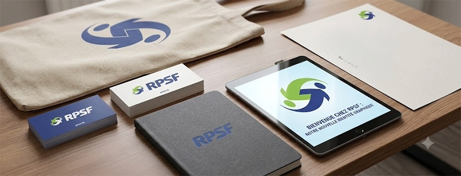

Montreal, July 20, 2026 – On the eve of launching its brand-new impact platform, Relations publiques sans frontières is reaching a historic milestone by unveiling its new brand identity today. Now embodied by the acronym RPSF, the organization has adopted a sleek, strong, and resolutely modern visual signature, the result of a long-term collaboration with the renowned Montreal firm Vasco.
This graphic evolution marks RPSF’s desire to increase its global reach and simplify its communication on digital platforms, while remaining deeply faithful to its history.
The evolution of a strong symbol: between continuity and modernity
A comparative analysis of the old and new logos reveals remarkable refinement. The brand retains its vibrant green and deep blue. These universal hues embody the codes of international cooperation, symbolizing environmental protection, sustainable development, ethics, and human solidarity.
The famous exchange symbol, illustrating two figures or curved arrows uniting to form a globe, has been stylized. Its lines are softened and its curves streamlined, evoking more than ever the agility, mutual listening, and knowledge transfer that characterize RPSF’s missions in the field.
The most striking change lies in the typography. The full name gives way to the capital letters RPSF, powered by a custom, bold, and slightly slanted font that breathes a sense of movement, action, and institutional authority.
“Our new visual identity is the exact reflection of what RPSF has become: an agile, structured, and action-oriented organization,” says Anne-Marie Caron, President of RPSF. “By focusing on the acronym RPSF, we are adopting a strong nomenclature, easily recognizable internationally by our partners and NGOs. This modern logo lays the aesthetic foundations for our major website redesign project, also entrusted to Vasco, which will be unveiled soon.”
A creation signed by Vasco
To carry out this major visual transition, RPSF relied on the strategic sensitivity of Vasco’s creative team, which is supporting the organization in the global overhaul of its digital communication tools.
“Reviewing RPSF’s brand image was an immense creative privilege,” explains Francine Léger, Vice President of Creation at Vasco. “Our goal was to respect the organization’s deep DNA — hence the retention of the solidarity curves and the green and blue duo — while giving it the stature of a major contemporary international NGO. By simplifying the lines and giving a monumental presence to the RPSF acronym, we have created a highly adaptive, human, and memorable brand for the 2026 digital environment.”
The deployment of this new visual identity will take place gradually across all of the organization’s communication tools over the coming weeks and will culminate with the official launch of the brand-new RPSF website.
– 30 –
About RPSF
Relations publiques sans frontières (RPSF) is an international non-profit organization. It collaborates with international cooperation organizations (ICOs) and local partners in developing countries by mobilizing public relations and communications professionals. These experts share their know-how on a voluntary basis to strengthen the capacities of populations, promote good governance, and maximize the impact of social and environmental projects.
About Vasco design
Vasco design international inc. is a graphic design and branding agency based in Montreal. Since its inception, the firm has supported companies, institutions, and socially-oriented organizations in creating impactful visual identities and deploying large-scale digital platforms.